Note: I mentioned this last year, but it is worth updating since different measures of inventory show significantly different year-over-year increases.
Yesterday the National Association of REALTORS® (NAR) reported that inventory was up 5.4% year-over-year:
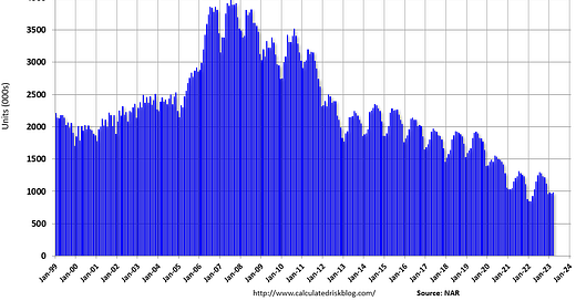
Total housing inventory registered at the end of March was 980,000 units, up 1.0% from February and 5.4% from one year ago (930,000).
Here is a graph of existing home inventory from the NAR since 1999:
And here is a graph from Redfin weekly data showing active inventory is below 2021 levels, and is close to the record lows in 2022:
However …
Other measures suggest inventory is up significantly year-over-year, although all measures indicate inventory is at historically low levels. Here is a graph from Realtor.com showing inventory in March was 59.9% above 2022 levels.
And on a weekly basis, Realtor.com reported inventory was up 28% year-over-year.
Active inventory growth continued to climb, with for-sale homes up 49% above one year ago
Altos Research also reported that inventory was up 51.6% compared to the same week in 2022, and down 52.4% compared to the same week in 2019. Here is a graph shows the seasonal pattern for active single-family inventory since 2015. The red line is for 2023. The black line is for 2019. Note that inventory is up from the previous two years (the record low was in 2022), but still well below normal levels.
And my local market survey showed active inventory was up 74% year-over-year in March (I try to just use active inventory, but some sites probably include some pending sales).
Understanding the Differences
First, it appears the NAR is including some pending sales in their inventory total. Housing economist Tom Lawler noted this:
As I’ve noted before, the inventory measure in most publicly-released local realtor/MLS reports excludes listings with pending contracts, but that is not the case for many of the reports sent to the NAR (referred to as the “NAR Report!”), Since the middle of [Spring 2020] inventory measures excluding pending listings have fallen much more sharply than inventory measures including such listings, and this latter inventory measure understates the decline in the effective inventory of homes for sale over the last several months.
Here is a graph comparing the year-over-year change in Realtor.com’s active inventory, the NAR’s inventory, and Realtor.com inventory including pending sales. Note that the blue line (NAR) and dashed black line (Realtor including pending sales) track.
As Lawler noted, including pending sales understated the decline in active inventory in 2020 and 2021, and is now understating the increase in active inventory.
But what about Redfin? Redfin takes a very different approach. Their active inventory number for any month includes homes that came on the market and sold quickly during the month, whereas the other measures are a snapshot at the end of the month (or week). For March, Redfin is saying the total number of active listings (including homes that sold quickly during the month) was up 9.2% YoY, whereas - according to Realtor.com, Altos, and my local surveys - there are about 50% or more active listings on the market at the end of March 2023 than in March 2022. Two different approaches to reporting the data.
Altos CEO Mike Simonsen also mentions immediate sales each week, but they aren’t included in active inventory at the end of the week.
Although tracking the level of immediate sales is important, I’ll be using the Altos / Realtor.com approach to reporting year-over-year active inventory (snapshot at the end of the period) in addition to the monthly NAR report.
Any way we look at inventory, the overall level of active inventory is historically very low.
How are listed and pulled (without a pending sale) tracked by these different measures? Seeing more of that.